List of Figures
Four Views of the Same Data
5-1: Scatterplot
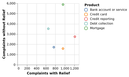
A scatterplot emphasizes the relationship between cases that received relief and those that did not for five different products.
(Vega-Lite demo)5-2: Clustered Barchart
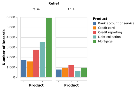
A clustered bar chart emphasizes the contrast between the number of people who requested relief and those who attained it.
(Vega-Lite demo)Note: Due to a printing error, 5.2-5.4 have different orders of captions in the book. This section follows the order of the images shown in the book.
5-3: Clustered Barchart
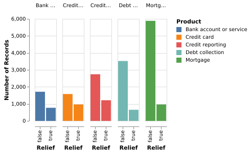
A different clustering emphasizes the different sizes of the populations who didn’t receive relief (and the similarity of those who did).
(Vega-Lite demo)5-4: Stacked Barchart
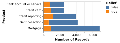
A stacked bar chart emphasizes the total number of complaints.
(Vega-Lite demo)Question: How Is a Value Distributed?
5-6: Categorical Histogram (C)
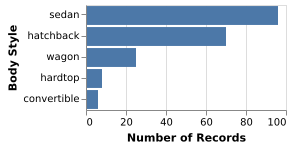
The distribution of car styles in the cars dataset.
(Vega-Lite demo)5-7: Quantitative Histogram (Q)
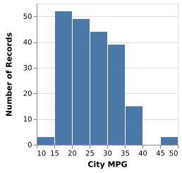
A kernel density estimate of the city-mpg field of the cars dataset. Smoothed with a narrow bandwidth, the dataset shows sharp peaks. Smoothed with a wider bandwidth, the dataset shows a gaussian-like distribution.
(Vega-Lite demo)5-8: Smoothed Histogram (Q)
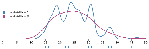
The distribution of car ratings for the city-mpg field.
(Vega demo)5-9: Box Plot (Q)
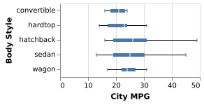
The distribution of car ratings for the city-mpg field.
(Vega-Lite demo)5-10: Categorical Density Plot (CxC)
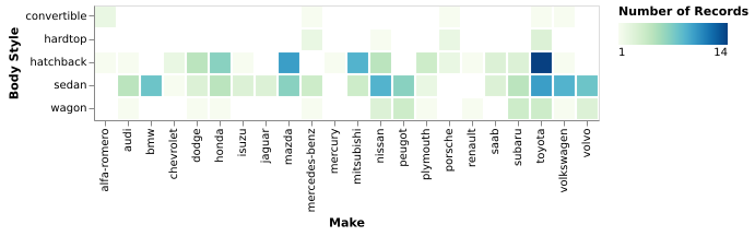
The number of cars, grouping body style by make.
(Vega-Lite demo)5-11: Continuous Density Plot (QxQ)
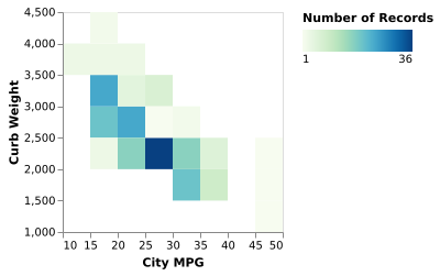
The joint distribution of efficiency, as measured in MPG, against the weight of the car.
(Vega-Lite demo)Question: How Do Groups Differ from Each Other?
5-12: Bar Chart (CxQ)
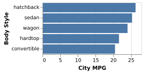
Bar length shows the average efficiency by body style using the same data as in Figure 5-9.
(Vega-Lite demo)5-13: Paired (or Multiple) Series Bar Chart (2CxQ)
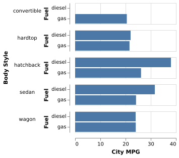
Efficiency by body style is now divided into diesel versus gas cars.
(Vega demo)5-14: Pie (or Doughnut) Chart (CxQ)
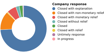
The CFPB data shows the ways that complaints have been closed.
(Vega demo)5.15: Heatmap (CxQxQ)
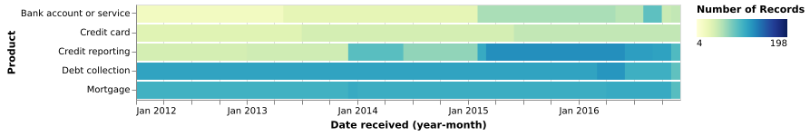
The CFPB data shows the ways that complaints have been closed, broken out by month and year.
(Vega-Lite demo)Question: Do Invidual Items Fall Into Groups? Is There a Relationship Between Attributes of Items?
5-16: Scatterplot (QxQ)
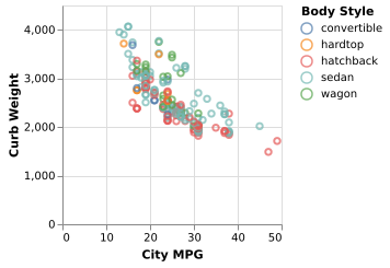
The relation between curb weight and MPG for five different styles of car.
(Vega-Lite demo)Note: Additional continuous, ordinal, or categorical variables can be added for size, color, and shape.
5-17: Line Chart (OxQ)
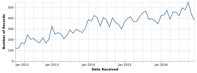
Count of consumer complaints by year and month for the CFPB data.
(Vega-Lite demo)5-18: Stacked Area Chart (OxQxC)
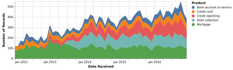
Count of consumer complaints, like Figure 5-17, broken out by product. Mortgages stabilized while credit reporting grew. This shows the same data as Figure 5-15.
(Vega-Lite demo)Question: How Are Objects Related To Each Other in a Network or Hierarchy?
5-19: Node-Link View (Force-Directed Layout) (relational)
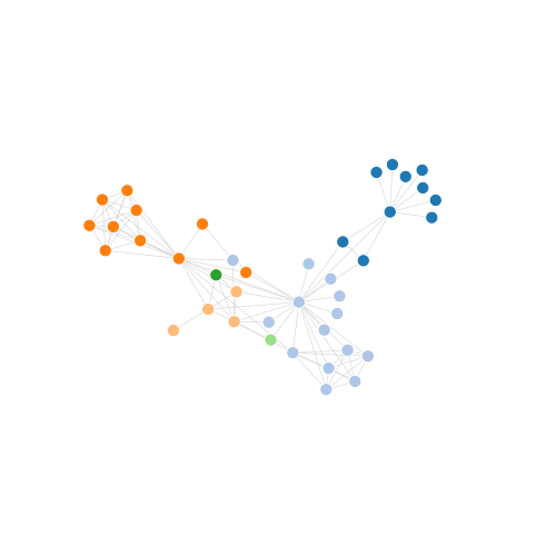
This data from the Les Miserables dataset shows coappearance in the novel between characters. The network has been truncated to 40 nodes for legibility. Colors are mapped to groups of characters
(Vega demo)Note: Additional attributes can be used to color or style nodes and links.
5-20: Circular Network Layout (relational)
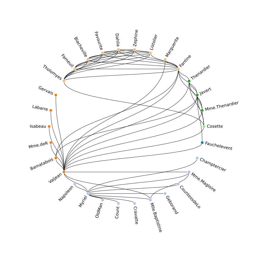
This data from the Les Miserables dataset shows coappearance in the novel between characters. The network has been truncated to 40 nodes for legibility. Colors are mapped to groups of characters
(Vega demo)5-21: Adjacency Matrix (relational)
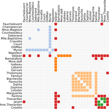
Shows the same data as Figures 5-19 and 5-20
(Vega demo)Note: Additional attributes can be used to color the cells.
5-22: Tree View (hierarchial)
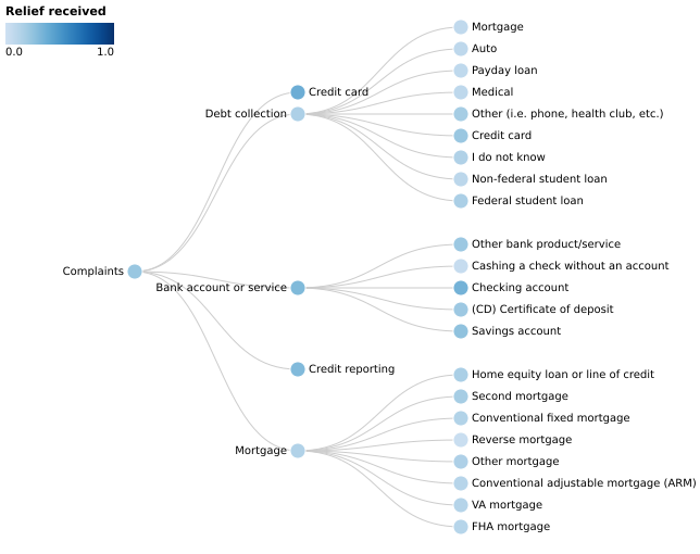
This is a hierarchy of the types of complaints to the CFPB and the percentage of them that received relief. The second layer of the tree corresponds to the values in Figures 5-1 through 5-4.
(Vega demo)Note: Additional attributes can be used to color the edges and nodes.
5-23: Treemap (hierarchial, QxQ)
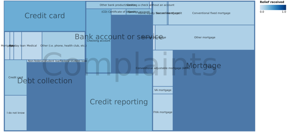
Represents the same data as Figure 5-22 but adds a second dimension for size: the number of complaints.
(Vega demo)5-24: Sunburst plot (hierarchial, QxQ)
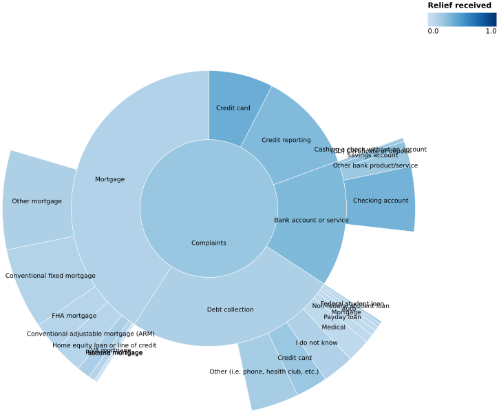
Represents the same data as Figure 5-23.
(Vega demo)Question: Where Are Objects Located?
5-25: Choropleth
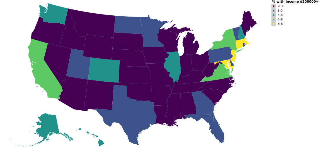
Values correspond to regions, such as states or counties. This chart uses census data to look at the percentage of the population with income over $200,000.
(Vega demo)5-26: Dotplot map
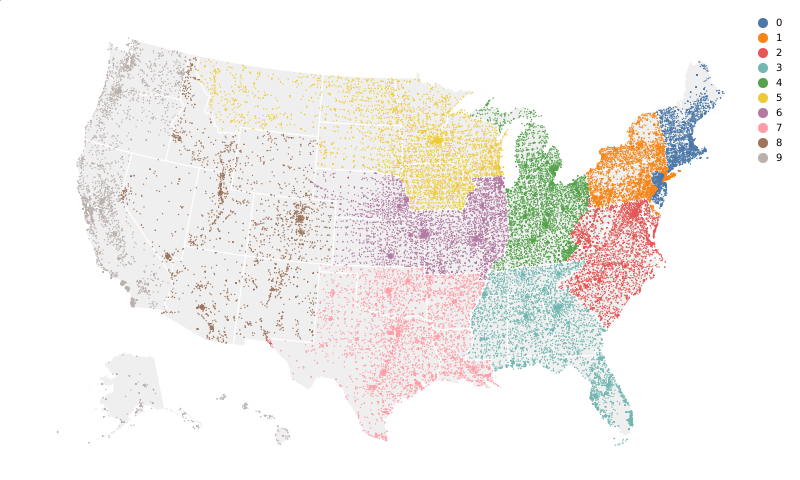
A scatterplot, where the x- and y-axes are geographical (or a list of geographical points); additional dimensions for size, color, or shape. Dots are located at the centroid of each zip code; the first digit encodes color.
(Vega demo)Question: What Is In This Text?
5-27: Word Cloud
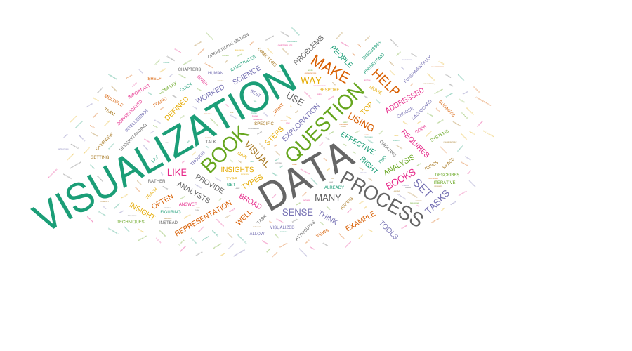
The text of the Preface to this book, sized by number of uses of the word. Color in this chart is arbitrary.
(Vega demo)Chapter 6: Multiviews
6-1: Small Multiples, Split by Dimension
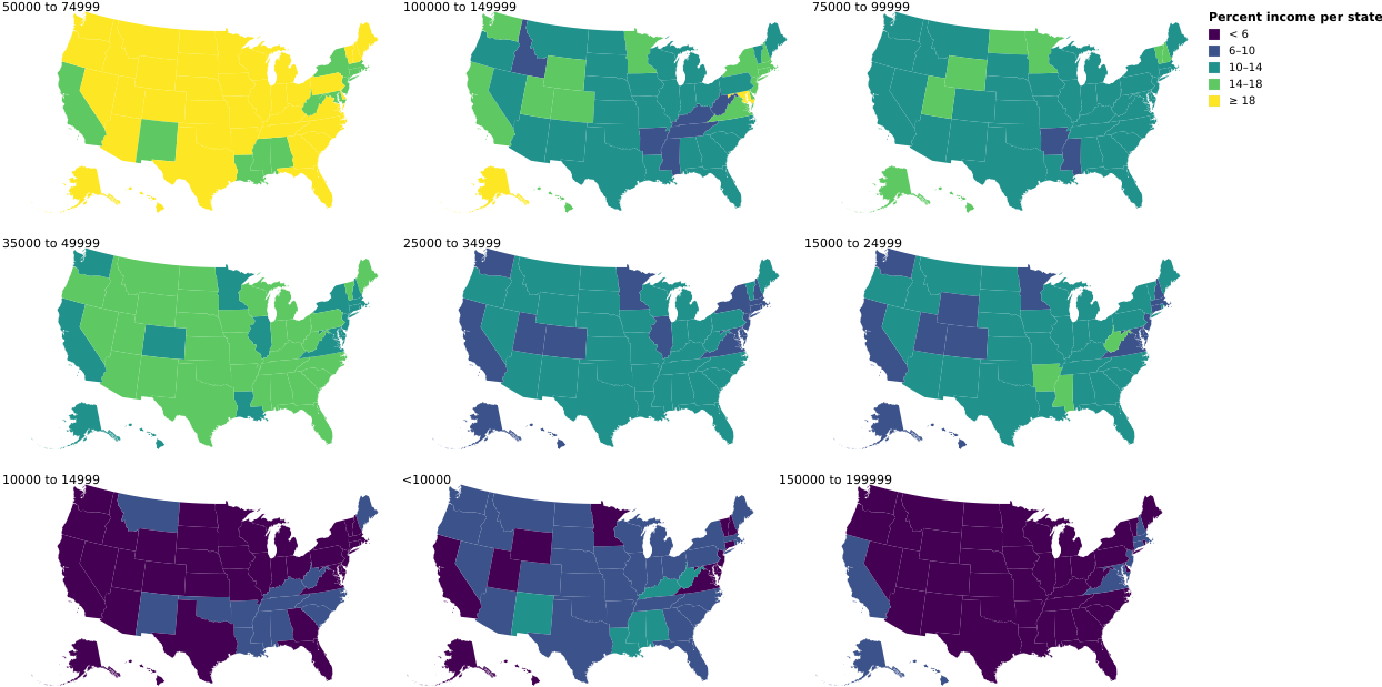
Small multiples of choropleths. In each choropleth, the percentages of the states’ populations for a specific salary range are shown—the small multiple views are partitioned over the set of salary ranges.
(Vega demo)6-9: Small Multiples, Showing Different Measures
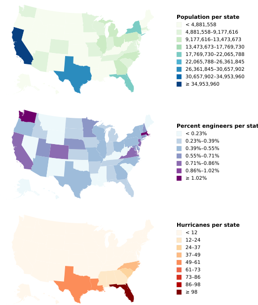
Even with different measures, these three choropleths illustrate the value of aligning scales and maintaining coordinate systems. The maps show the population of each state, the percentage of the population that are engineers, and the number of hurricanes. (The very different map color schemes suggest that engineers do not cause hurricanes.)
(Vega demo)6-2: SPLOM
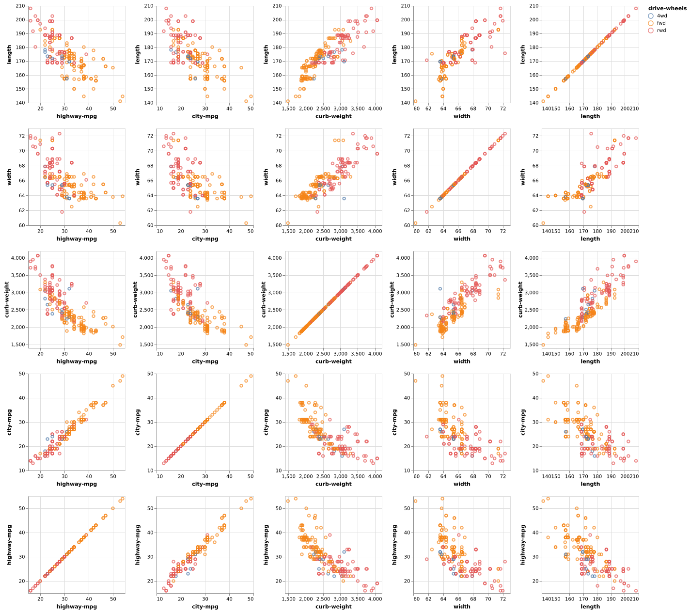
A SPLOM comparing attributes of cars in the scatterplots, with a color encoding indicating whether the cars are all-, rear-, or front-wheel drive. This chart helps show, for example, that rear- and front-wheel-drive cars can be separated by their curb weight in conjunction with city-mpg or highway-mpg more than by their width and length.
(Vega-Lite demo)6-10: Cross-Selection
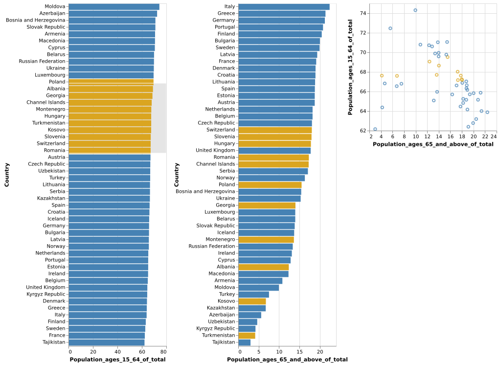
The three views—two sorted bar charts and a scatterplot—are linked together. The user has selected a region of the scatterplot (grey box, orange dots), and the selected values correspondingly light up on the bar charts. This is based on the World Bank dataset.
(Vega-Lite demo)